A Guide To Choosing the Perfect Color Palette For Your Home
October 16, 2024
Choosing the right color palette for your home can feel like a daunting task, but it’s one of the most important decisions you’ll make in shaping the ambiance of your space. Whether you’re going for a cozy, calming retreat or a vibrant, bold statement, your color choices will set the tone for the entire environment. Here’s a step-by-step guide to help you pick the perfect colors for your home.
Understand the Mood You Want to Create
Before picking specific colors, think about the overall feeling you want in each room. Colors have a strong psychological impact, and different tones evoke different emotions. Here’s a quick guide:
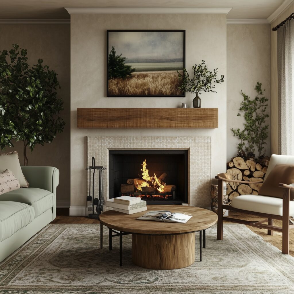
Living Room/Family Room: Neutral tones like beige, taupe, or soft grays create a welcoming and cozy environment. If you want a more lively space, consider accenting with warm shades like mustard yellow or soft reds.
Bedroom: Blues, greens, and soft purples are often associated with calmness and relaxation—perfect for a restful night’s sleep. Avoid overly bright or bold colors in this space as they can be too stimulating.
Kitchen: Whites and light grays create a clean, fresh feel, while bolder choices like navy blue or deep green can give the room a modern twist. If you like something energetic, a sunny yellow or soft orange can work as accent colors.
Bathroom: Soft pastels or light neutrals give a clean, serene vibe. If you want to create a spa-like retreat, consider soft blues, seafoam green, or light gray.

Consider Your Lighting
Lighting plays a crucial role in how colors appear in your home, often making or breaking the intended effect of your palette. A color that looks perfect in the store may look completely different once applied to your walls, depending on the amount and type of lighting in your space.
Natural Light
Natural light tends to show colors in their truest form. However, the amount of natural light and the direction your windows face can change how a color looks throughout the day:
- North-Facing Rooms: These rooms often receive cooler, softer light, which can make colors appear a little muted or grayer. If you want to warm up the space, choose colors with warmer undertones—such as creamy whites, soft yellows, or warm grays.
- South-Facing Rooms: These rooms tend to be bathed in warm, bright sunlight throughout most of the day. This abundant light allows you to embrace deeper or cooler colors, such as charcoal gray or navy blue, as they will be softened by the natural light.
- East-Facing Rooms: The light in these rooms is cooler and bright in the morning but fades throughout the day. To make the most of this type of lighting, consider warm-toned colors to balance out the cooler morning light.
- West-Facing Rooms: These spaces will have a warm glow in the late afternoon and evening. Choosing cooler-toned colors, such as soft blues or greens, can help counterbalance the rich, warm light later in the day.
Artificial Lighting
Artificial lighting also significantly affects how colors appear, especially in the evening when natural light fades. The type of bulbs you use can alter the appearance of your chosen hues:
- Incandescent Bulbs: These bulbs give off a warm, yellow light, which can intensify warm colors like red, orange, or yellow and make cool colors like blue or green appear muted.
- LED Bulbs: LEDs are available in a range of tones from warm white to daylight. Cooler-toned LEDs can make colors appear crisper and brighter, while warmer LEDs mimic the effect of incandescent lighting.
- Fluorescent Bulbs: Often associated with cooler, bluer tones, fluorescent lighting can make warmer colors appear washed out but works well with cooler, more neutral shades like light blues or grays.
To ensure your chosen colors look great in all types of light, test samples on your walls and observe them at different times of day and under various lighting conditions. You might be surprised how different a color looks in the morning versus the evening!

Get Creative with Accents and Patterns
While solid colors are the foundation of any room, incorporating patterns, textures, and unique accents can elevate your space to the next level. Here are several ways to get creative with these design elements:
Accent Walls
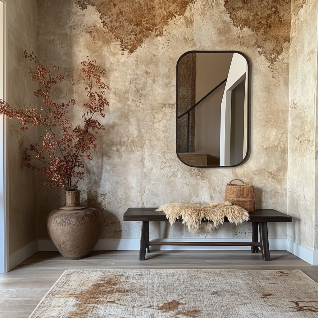
An accent wall is an easy way to experiment with bolder colors without committing to an entire room. Choose a wall that naturally draws attention, such as behind a bed or sofa, and paint it in a contrasting color or use patterned wallpaper to create a focal point. For a modern look, consider a geometric design, while floral or nature-inspired prints can add a softer, more traditional touch.
Pro Tip: If you’re hesitant to use strong colors, try a slightly darker or richer shade of your dominant wall color for a subtle yet striking effect.
Patterns in Textiles
Patterns bring movement and energy to a room, but they should be used strategically to avoid overwhelming the space. Textiles like rugs, throw pillows, curtains, and upholstered furniture are perfect opportunities to introduce playful designs.
- Bold Patterns: Stripes, florals, geometric shapes, or animal prints can create a dynamic look. Use these in small doses to keep them from overpowering the room. For example, a patterned rug or a few pillows can add interest to a neutral-colored sofa.
- Subtle Patterns: If bold isn’t your style, opt for more subdued patterns like tone-on-tone designs, herringbone, or small-scale geometrics. These still add depth and interest without commanding too much attention.
Layering Tip: Don’t be afraid to mix patterns. The key is to ensure they share a common color palette or complementary tones so they don’t clash. For example, a striped pillow can pair well with a floral one if both feature the same dominant color.
Textures for Depth
While patterns engage the eye, textures add depth and dimension, making a room feel more dynamic and inviting. Consider adding texture through:
- Textured walls: Use materials like shiplap, brick, or plaster for a tactile element.
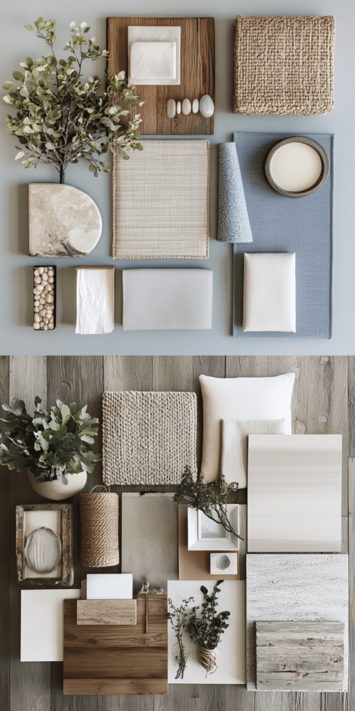
- Fabrics: Layer soft materials like velvet or linen with rougher elements like jute or leather for contrast.
- Furniture: A mix of sleek and rustic finishes can create a unique and cozy space. For example, pairing a smooth marble coffee table with a rugged wood bench adds visual interest.
Unique Accents
Besides patterns and textures, look for unexpected ways to incorporate color and personality through accents:
- Bold Artwork: A large, colorful piece of artwork can become the focal point of a room, tying together various elements of your color palette.
- Decorative Accessories: Lamps, vases, books, and even planters can add small pops of color or pattern in subtle ways. Metallic accents—like gold, copper, or brass—also offer a sophisticated touch to neutral spaces.
- Ceiling Accents: Don’t forget about the fifth wall—the ceiling! Painting or wallpapering the ceiling can create a dramatic effect, especially in smaller rooms or spaces where you want to draw the eye upward.
Tip: Choose one or two creative accents to focus on, so the room feels curated and intentional, rather than cluttered.

Choosing the perfect color palette for your home is a creative process, but it can also be overwhelming. If you’re feeling unsure about your choices or want professional guidance to achieve a cohesive look throughout your space, our interior design studio is here to help. We specialize in creating custom whole-home color palettes that reflect your personal style while ensuring harmony from room to room.
Contact us today for a complimentary design consultation!
Notes: **All images in this post are designed with AI by Homestead Designs Plus, LLC.**
Leave a Reply Cancel reply
© 2021-25 Homestead Designs+
Find US ON
JOIN OUR NEWSLETTER
A monthly sprinkle of design inspiration...
send
PRIVACY POLICY
A monthly sprinkle of design inspiration...
to
coast
coast.
Serving clients